The Nature Lodge

The Nature Lodge is a budding, environmental-educational nonprofit from Santa Cruz County, California with a mission to inspire, encourage and educate environmental stewards of today, for a more sustainable future.
With a long-term vision of creating an ecological campus, their vision is to create an educational hub where immersive education can happen, a space where people can see the efforts and innovations that are happening right now today, to help benefit the planet.
For now they strive to inform their local community members in an online capacity.
Project Overview
As a part of a General Assembly UX immersive design course, my team and I were challenged to assist The Nature Lodge (TNL) with enhancing their website to increase overall user engagement within the site, increase discoverability of their upcoming events, and design a way to better spread the word about TNL and its events via the website and social media.
The Challenge
How might we provide information to users about how to help the environment within their community and how might we build trust and credibility within the site so users are more willing to donate their time, money and resources to The Nature Lodge.
Understanding The Problem
Users need a way to efficiently access information and confidently donate their time & money to help the environment so that they can make an impact on their community.
The Solution
By creating a seamless flow throughout the website, we will help users identify ways to get involved with helping the environment through The Nature Lodge.
Role
UX Designer
Duration
3 week sprint
Tools
Figma
Maze
Optimal Sort
Pencil, Pen, Paper


To begin our research, we first analyzed what the site does well in relation to today’s design principles. The mission is well showcased, front and center of the homepage. The site is accessible in other languages, which is ideal as the home-base of the nonprofit has a large population of hispanics, and there are many opportunities on the website to get involved, whether it be through events, at-home activities or volunteering.
We conducted an in-depth heuristic analysis of the current site and discovered 5 main areas to focus on: Consistency, Accessibility, Recognition, Aesthetic, and Visibility which we will go more in depth below.
Heuristic Analysis
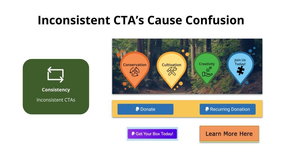
Consistency
Inconsistent call to action buttons are used throughout the site, which can cause confusion for the user when navigating through the site.
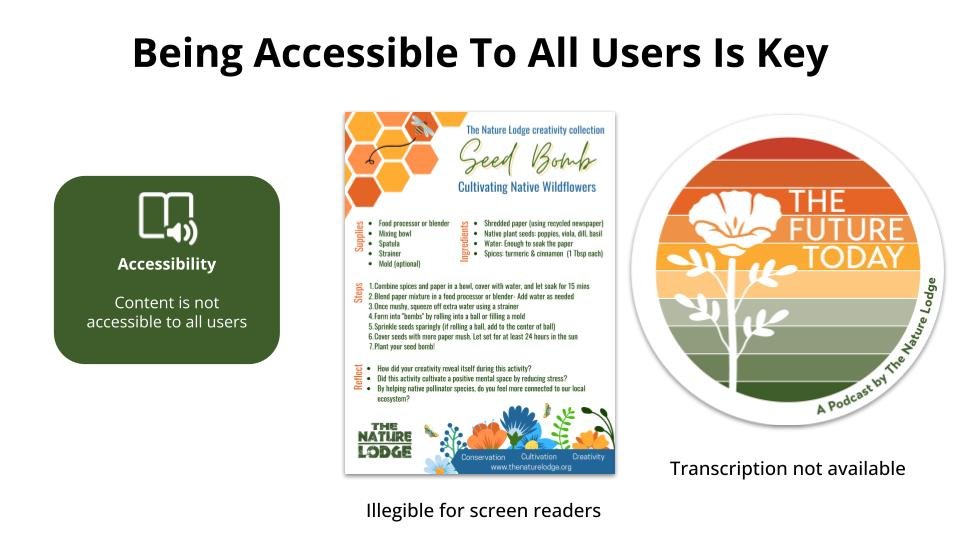
Accessibility
The infographics on the activities page are currently in a pdf format -which is great for sharing, but this type of information should be typed out within the site to help those with visual impairments use screen readers.

Aesthetic
The navigation takes up a lot of real estate on the pages. Any important elements such as the mission statement that the nonprofit is trying to highlight will be missed as it gets cut off at the fold of the screen
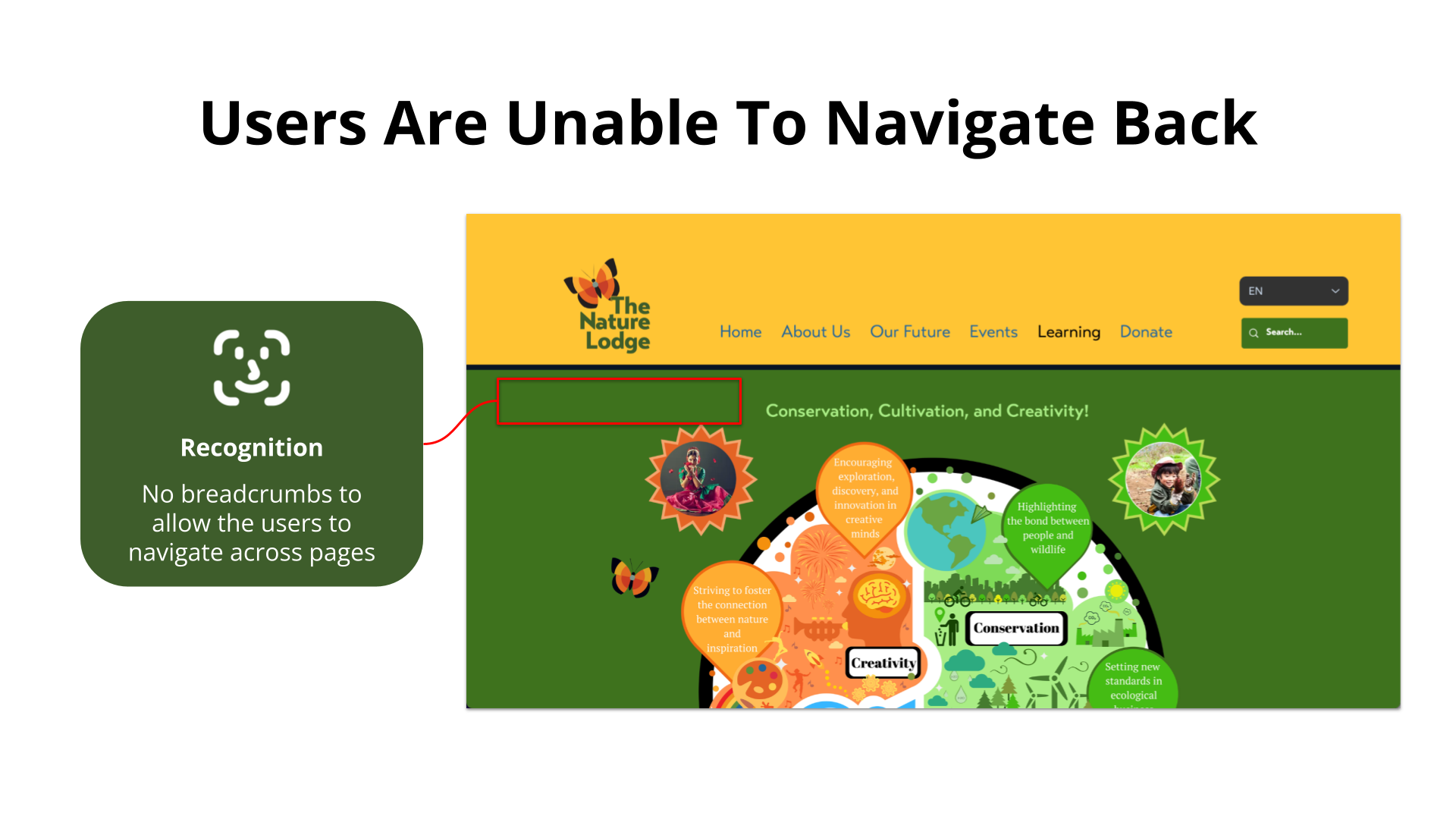
Recognition
Navigation breadcrumbs keep the user informed on where they are in regards to the website. Not having them can cause user frustration as they can get lost if they misclick something. Additionally having breadcrumbs encourages browsing of the site.

Visibility
Tutorials in the “Activities” tab are difficult to navigate through due to the infinite scroll feature and the navigation bar disappearing. If we display these tutorials in a digestible way, users will have a better experience.

We conducted a competitive analysis to see how The Nature Lodge ranked against other environmental nonprofits. We found that TNL does include these common features, but can be improved on.
Features to focus on:
Include an event description for each event page
A blogs page that can be easily shared across social media platforms
A donation page with a familiar format to gain user trust
An educational page that aligns with the organization’s values
An area to showcase the organizations future goals
Card Sort/Site Map

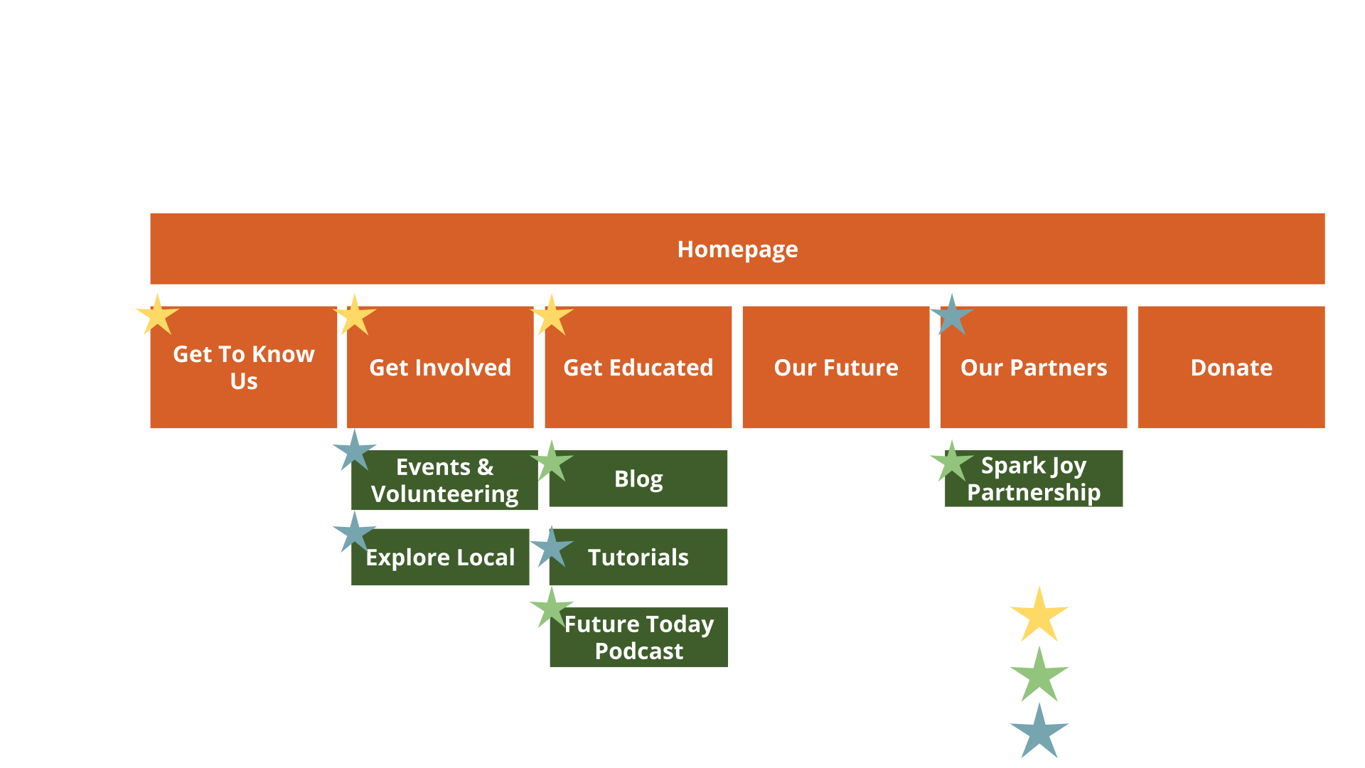
In our first round of usability tests, we found that our users were confused with what some of these subcategories meant, and how they were organized.
To better understand how users think, we created a card sorting activity and asked our users to reorganize those categories in a way that makes sense to them.
Some changes we made after analyzing the results:
The Home tab was removed altogether, as it is common practice for people to navigate back to the homepage by clicking the logo at the top of the page.
“Mission & Vision” were removed and relocated within the “Get To Know Us” page.
We created the “Get Involved” category to include content for events and volunteering opportunities, and the Santa Cruz page was renamed to “Explore Local”.
Get Educated is a new tab containing all informational items such as blog, activities, and the podcast.
We nested the Renderings page to live within Our Future, eliminating a secondary navigation slot.
Lastly, we created an Our Partners page to highlight established partnerships and to showcase new or future partnership opportunities.
Defining the User
We interviewed users to better understand their involvements and pain points relating to the environment and other non profits and created and created an Affinity Map.

Some trends we found were:
There is a compelling urge to help take care of our planet, but there is lack of accessible information to learn where to begin, which can lead users to feel overwhelmed.
There is frustration around whether or not a nonprofits website feels credible, which can make users hesitate on donating their money.
They are concerned with climate change, but feel that there is a lack of support in their local community

Synthesizing the data from our 7 interviews, we were able to create our persona, meet Gretta Depp

To better understand her pain points, we mapped out her journey of encountering TNL website for the first time

My team and I regrouped to realign our priorities and divided the focus of our efforts in terms of, Must, Should, and Could Have

Designing for the User
The Events & Volunteering Page
To the left, we have a calendar that doesn’t reflect upcoming event dates.
On the right, we do get to see upcoming events, but we lack additional information like an address, a description, a blurb on what to expect.

Redesign: Events and Volunteering Page

To enhance the sign up experience for our users:
On the left, we expanded the page to showcase all events with short detailed summaries.
Incorporated a calendar on the landing page to load all informational details on one singular page to streamline the process.
Added search filters to allow sorting of available events and volunteer opportunities.
On the details page to the right, we incorporated a key summary at the top of the page with a clear CTA button to sign up.
Below that, there is an in-depth event description and key things to know, such as what a volunteer should bring with them for an event.
A section to showcase the open volunteer opportunities for that specific event.
As a plus, we embedded a map so that users won’t have to leave off the site to navigate directions.
The Activities Page

We know that the current activities page is hard to navigate through due to the secondary navigation disappearing caused by the infinite scroll feature and that it does not pass an accessibility test as the text on the page is in an image format, which does not allow for users who are visually impaired to use screen readers.
Our solution is to:
Showcase all activities on the landing page in a digestible format -making more use of the white space.
Create a description page for each activity so that users can easily read through and share with friends on socials.
The Donation Page

To improve the donation process:
we wanted to provide more contextual information about the nonprofit on the landing page itself -which can increase trust, as people appreciate transparency.
Additionally, if people do not have money to give, we’ve incorporated the option of donating resources or time directly on the page to showcase other ways people can help the cause.
Lastly, within the donation process itself, we added more details about where the monetary donation is going to assist with credibility.
Reflections
I genuinely enjoyed this experience of working on a team that communicated well, and working with a real client. The most valuable lesson I’d say was remembering to stay within the means of our agreed statement of work. I blame the wonderful dynamic shared within our team. We got carried away when we should have stayed focused within the terms of our agreement, but we saw so much potential and our ideas just kept flowing. It wasn’t until things started to feel overwhelming that my team and I decided to review the statement of work and it was then where we realized we needed to reel it back in, but we were days shy of our deadline when we came to our realization. Our client gave us the flexibility and creative freedom to play with our ideas which greatly contributed to how fun this project was for me. The result was a design that I’m very proud of. It was so well liked that our client extended an offer for my team and I to continue our work for her nonprofit organization.